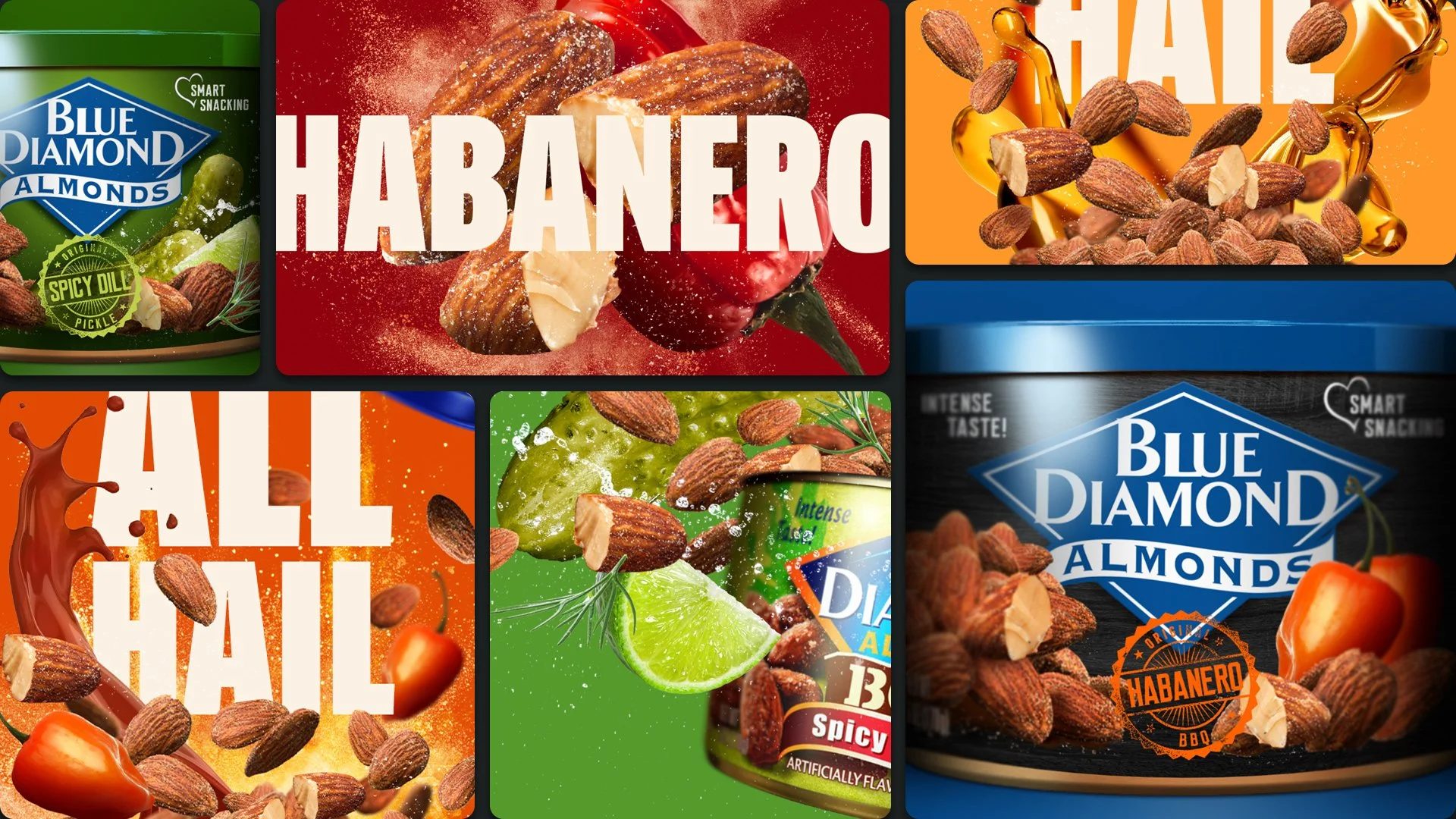
I started my career in design, and I’ve done a lot of it through the years. Although it hasn’t been my focus in more than a decade, I always roll up my sleeves when it’s needed. Here’s a few projects worth pointing out. While not always conceptual in nature, they’ve required complex problem solving and were crafty as heck.

DESIGN & BRANDING
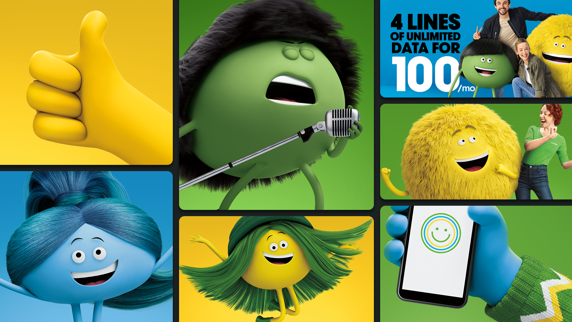
Cricket Wireless: Full Brand Refresh

We updated and unified the brand's identity system and institutionalized it amongst Cricket's partner agencies so every touchpoint would be just as Cricket-y as the last. Working with an outside branding consulting agency and ARGO's internal design department, I led a complete brand overhaul over an 18 month period. Resulting in a sharper strategic positioning, a stronger brand soul, an emormous asset library of CG characters and brand elements, and an exhaustive guidelines document that helped educate teams across the entire business.

My Role: GCD (overseeing the full workflow), Art Direction, Design
Designers: Angie McDonald, Michael Sison, Laura Rodrigues
Writer: Kadesha Goins
Agency: ARGONAUT
Brand Consultancy: VSA

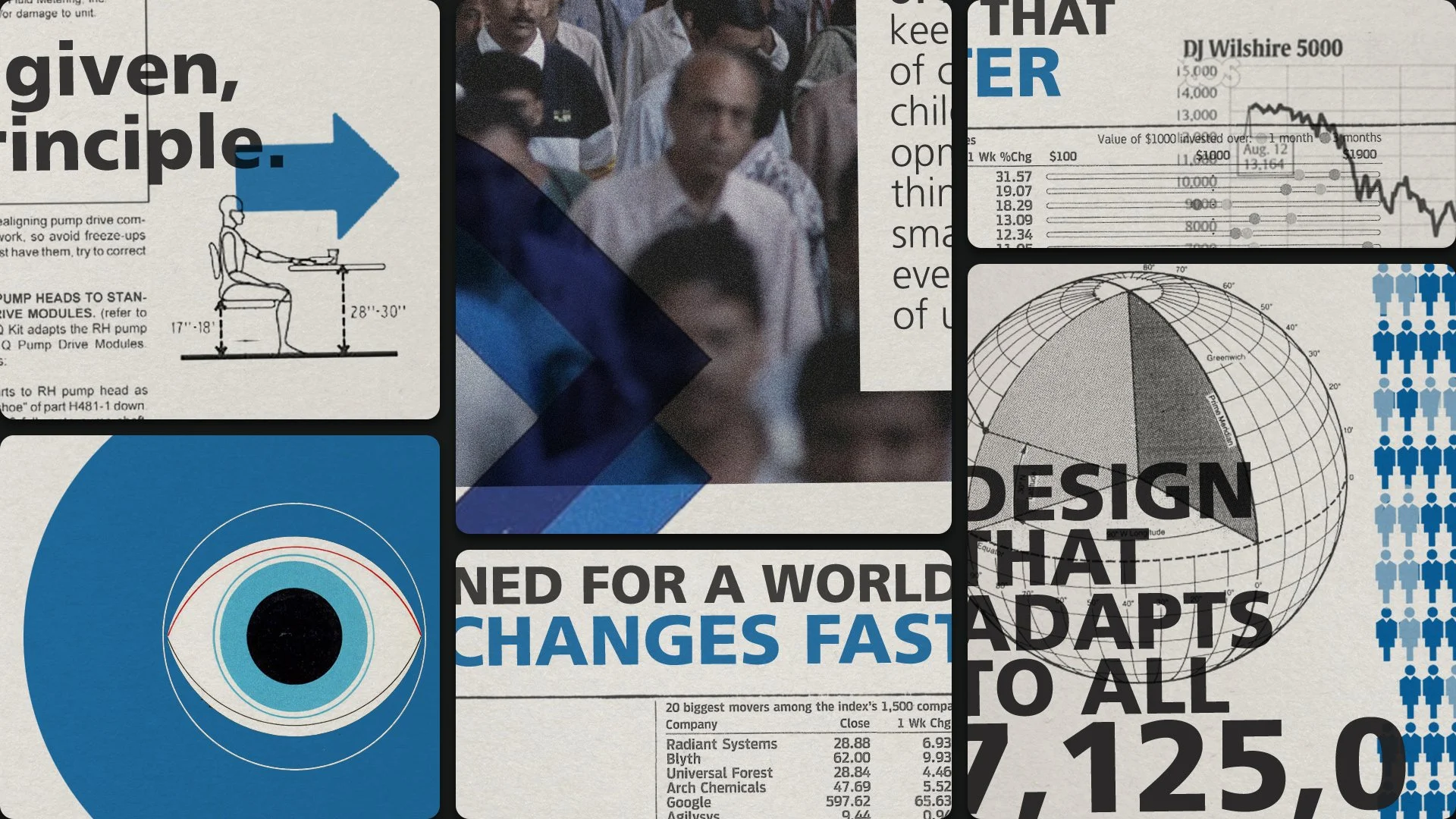
MetLife: Designed For Life

This was one of the internal packages we put together to help sell the platform idea to all the stakeholders internally. It's meant to telegraph the rigor MetLife put's into designing their products, and the care they have for their clients.

My Role: Creative Direction, Art Direction, Design
Writer: Anders Gustafsson
Agency: ARGONAUT
CCO: Rick Condos

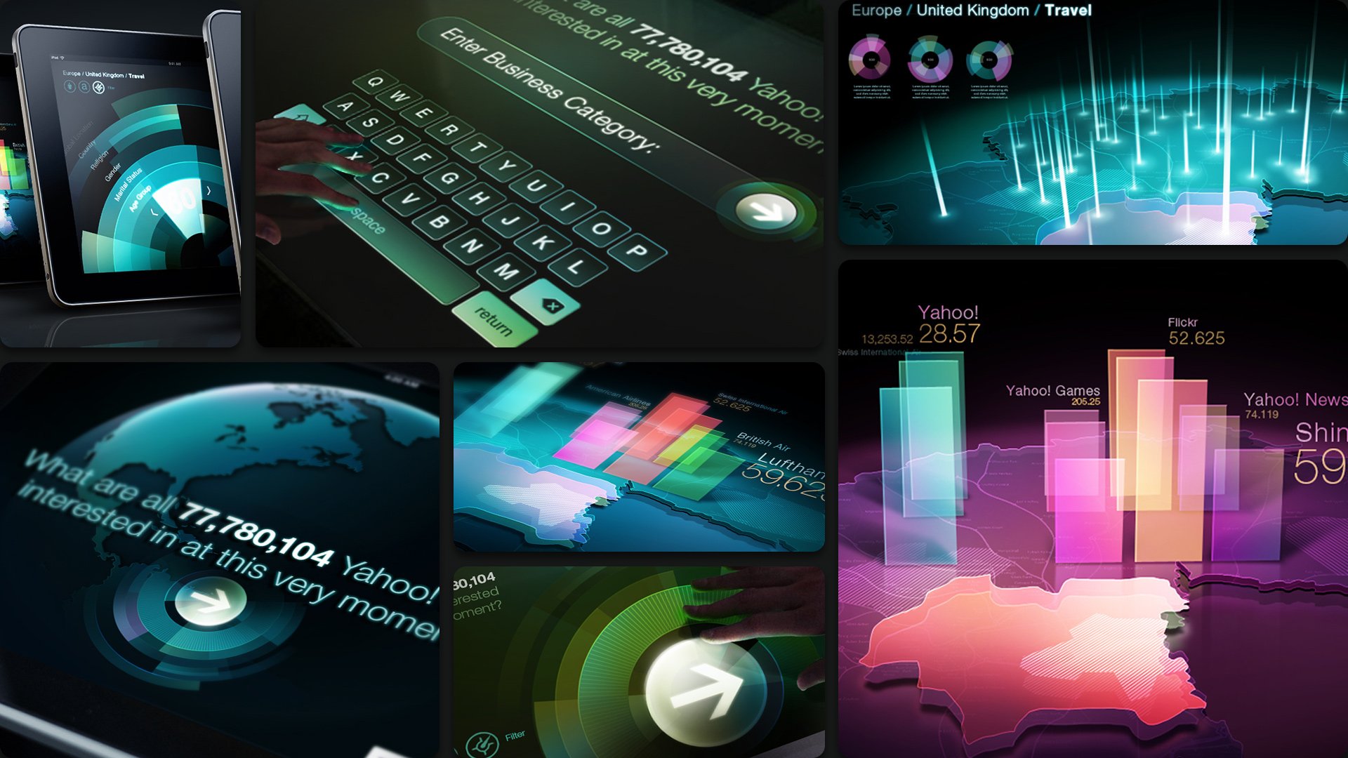
Yahoo! Living Data

Massive data comes alive through visual case studies. Imagine if you could learn from what all 77MM people on Yahoo! are doing and thinking at any given time. We did, and decided to take the immense amount of information from Yahoo! Analytics spread sheets and visualize it for, well, everyone—especially their sales force. Through massive touchscreens, mobile apps and kiosks, we gave people the chance to test drive all of the power and scale available from Yahoo!, and experience the incredibly granular insights and customization abilities through visual case studies.

My Role: Art Direction, Design
Writer: Brian Thompson
Agency: Goodby Silverstein
CD: Will McGinness

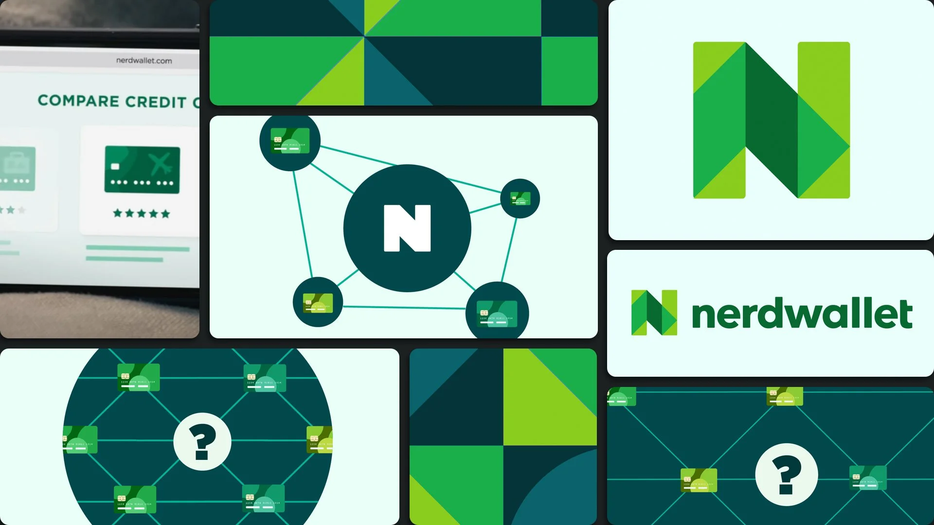
Nerdwallet Visual System

I led the development of the visual system as it relates to advertising. Working from existing corporate assets, I worked with our internal team, and an external MGFX vendor to develop a robust communication system that allowed for more flexibility in assets like video, where we needed to comunicate more complicated notions. This exercise led to the creation of the system that expanded from a simple mnemonic to complex data vis, to interfaces and even OOH illustrations.

My Role: Creative Direction, Design Direction
Agency: ARGONAUT
Design Dir.: Angie McDonald
Design: Zach Charters, Will Ward
Design/MGFX: Buck

YouTube Politics Channel

We worked with YouTube to create an online elections hub by aggregating election coverage from the top news sources around the world, with the intent that a user could get all their news coverage from one contained source. Sources included archived and live coverage from staples like WSJ and NYT, non-partisan stations like Aljazeera, and well known online personalities like Philip Defranco and Larry King. The content was organized by the phases of the election and provided real-time election results.

My Role: ACD, Art Direction, Design
Agency: Goodby, Silverstein & Partners
ECD: Christian Haas

Interfaces Designed For Film
I’ve always been intricately involved in the design of elements that show up in the films I make. Sometimes designing them myself, but most often, leading other designers (and the art department) to the final result.
Below are a few samples from a Cisco campaign that imagined interfaces based on human interaction in a future world.
Creating a “Brand World”
This is a miscellaneous batch of rough work I created for pitches, that unfortunately didn’t made it out into the world. These obviously were very rough and created very quickly in order to find a visual style for teams to work off of, ensuring that all the work feels consistent.

A strong, consistent ‘Brand World’ can be a brands secret weapon. It’s about finding the icon in the brand—uncovering its soul—simplifying a brand into its core essential elements with the core purpose of making it
more memorable, ironclad, and timeless.
Taking a vigorous, fresh, hard look at brands—keeping what’s working, tossing what’s not, adding new things, all in the singular effort to make a brand as simple, distinct and ICONIC as it can be.

Note: these comps occasionally use other peoples art/photography as a quick starting point to kick off the explore—all credit goes to the creators in those instances.

The rest...

Previous
Previous

My Process